What's inside this article:
- Basic information
- Get started
- Select a layout
- Set content: Auto mode
- Set content: Manual mode
- Manage settings
- Check the preview
- Save the widget
Basic information
This article explains how to create a new Multimedia widget.
What is a Multimedia widget?
This widget displays one On-demand media content (video or audio) can be accessed by website visitors at any time, unlike live content, which is only available during broadcast. media item at a time. The player is available directly on the widget, allowing visitors to start consuming the content immediately without navigating to a new page.
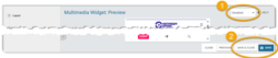
The player supports sticky mode, which keeps content playing and displays a minimized player as visitors browse between pages. Sticky mode supports:
- (A): Horizontal videos
- (B): Vertical videos
- (C): Audio
Get started
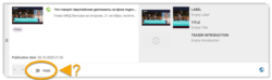
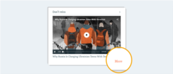
This article assumes that the edit page for your new Multimedia widget (shown below) is already open.
Find more details below:
To create a new widget, start by opening the edit page for the page or component where you want to display the widget.
On Pangea websites, the following types of pages and components are built using widgets:
- Sections (such as your homepage)
- Infopages
- Landings
- You Might Also Like
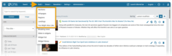
To open the relevant edit page, go to Build in the primary navigation.
For detailed information, see the relevant article below, depending where you want to display the widget:
You might also create a new Multimedia widget from the Widget library. For detailed information, see the following article:
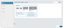
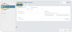
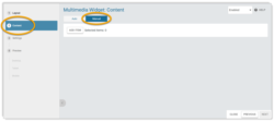
The edit page for a Multimedia widget is divided into the following subpages:
- Layout
- Content
- Settings
- Preview
For new widgets:
You need to move through the subpages in order:
- Use the Next button to progress.
- Use the Previous button to move back.
You will not be able to save the widget until you reach the Preview subpage.
For existing widgets:
You can navigate directly to any subpage using the options in the left panel. You can save the widget from any subpage.
To save the widget, hit Save / Save & close in the bottom-right corner of the edit page. Pangea will not save or apply your changes on the public website until you perform this action. This applies for both new and existing widgets.
For more information, go to the following section in this article:
The remaining sections in this article describe each stage of the creation process:
- Select a layout
- Set content: Auto mode
- Set content: Manual mode
- Manage settings
- Check the preview
- Save the widget
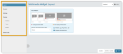
Select a layout
For a Multimedia widget, only one layout is available. This layout will seamlessly adapt to display either video or audio content.
A Multimedia widget shows different elements, depending on the type of content currently displayed (horizontal video, vertical video, or audio), and the viewing device.
Find more details below:
Overview
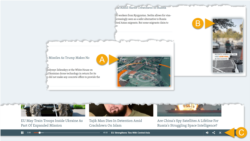
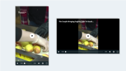
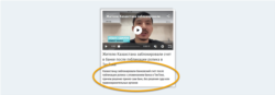
The player and all controls are available directly on the widget. While the video is not playing, a A thumbnail is a static image, which appears inside a video player before playback begins. Strong thumbnails help your videos to stand out, drive engagement, and give potential viewers a quick visual preview of what to expect from each video. Learn more. image appears inside the player.
Set the thumbnail
Vertical videos display differently, depending on the viewing device:
- Mobile: Vertical videos appear inside a vertical player.
- Desktop + tablet: Vertical videos appear inside a horizontal player with pillarboxing.
This means that for vertical videos, you need to consider both the horizontal and vertical thumbnail. Two options are available for how to set the thumbnails:
- You can set the default thumbnails for any on-demand video from the video edit page in Pangea CMS. For details, see the following article:
- In Manual mode, you can update the thumbnails directly from the widget edit page. For details, go to the following section in this article:
Required elements
For every vertical video, the widget shows the following elements:
| Element | Visible on (devices) |
|---|---|
| Title | All devices |
| Horizontal image (thumbnail) | Desktop + tablet |
| Vertical image (thumbnail) | Mobile |
Optional elements
The widget might show the following additional elements (depending on the layout settings):
| Element | Visible on (devices) |
|---|---|
| Category/Date/Label | All devices |
| Introduction | Desktop + tablet |
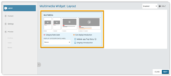
On the Layout subpage, you can set the layout settings for the widget.
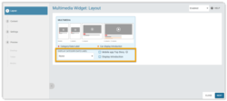
The following settings are available:
- Display Category/Date/Label: If an element is selected (Category, Label, Exact time, or Relative time), the widget shows your selected element above the title for the media item.
- Display introduction: If ticked, the widget can show introductions.
- Mobile app Top story: If ticked, the widget is used as the top story on the old version of the mobile app homepage.
Find more details below:
You can display an additional element above the title for the media item.
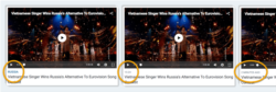
Choose your preferred option:
- None
- Category
- Label
- Exact time
- Relative time
None
Display only the title without an additional element.
Category
Display the name of the The Primary Category is the main Category for a content page. A page can have multiple Categories, but only one Primary Category. Any additional Categories are added as Secondary Categories. Both Primary and Secondary Categories impact how the content is shared. However, only the Primary Category impacts the layout and design of the page. Learn more.. The text links to the Category page for the Primary Category.
Label
Display a custom label. Labels are commonly topics that categorize the content on a widget (such as "Politics" or "Sport").
The widget can only show a label if a label is available in the data for the media item. You can add a label via Website teaser > Label on the edit page for a Video or Audio clip.
In Manual mode, you can also add a label directly from the widget edit page. For details, go to the following section in this article:
Exact time
Display a timestamp with the exact time and / or date of publication. The format for the time and date varies, according to your site configuration.
Relative time
Display a timestamp that shows how long ago the item was published (for example, "20 minutes ago"). After a set amount of time, the relative timestamp changes to an exact timestamp. The timing varies, according to your site configuration.
Tick Display introduction if you want the widget to display introductions.
The following rules apply:
- Introductions are only displayed when your site is viewed on desktop or tablet. Introductions are not shown on mobile.
- The widget can only show an introduction if an introduction is available in the data for the media item.
Add an introduction
For a Video / Audio clip, the widget introduction is taken as follows (if 1 is not filled, the text is taken from 2):
- (1): The Teaser introduction (set via Website teaser > Introduction on the edit page for the Video / Audio clip).
- (2): The General introduction (set via General > Introduction on the edit page for the Video / Audio clip).
For a Broadcast program / Audio feature, the widget introduction is taken from the Description field on the edit page for the Broadcast program / Audio feature.
In Manual mode, you can also add an introduction directly from the widget edit page. For details, go to the following section in this article:
Set content: Auto mode
This section explains how to use auto mode to set the widget content. To enable auto mode, select the Auto tab on the Content subpage.
For information about auto mode, browse the sections below:
Auto mode: Overview
Auto mode reduces the need for manual widget updates. Each widget updates automatically, always promoting the latest content that meets the individual widget requirements. For example, you might configure a widget that always promotes the latest video from a particular Category. This approach allows editors to focus on publishing new content, rather than updating widgets.
Auto mode: Set widget requirements
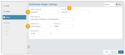
Set the widget requirements using the settings under the Auto tab.
The following settings are available:
Auto mode: Check your requirements
After configuring the settings, hit the Update button. The latest item that meets your requirements will then be shown below the settings.
If you are not happy with this item, you can adjust the settings. Hit the Update button again to check the results.
Auto mode: Hide an item
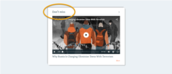
In auto mode, you can hide an item. While an item is hidden, the item is not displayed on the published widget.
To hide an item, enable the Hide slider in the item box. The next valid item is added to the widget to replace the hidden item.
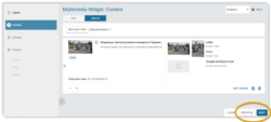
Set content: Manual mode
This section explains how to use manual mode to set the widget content. To enable manual mode, select the Manual tab on the Content subpage.
For information about manual mode, browse the sections below:
Manual mode: Overview
Manual mode supports a curated approach, allowing you to highlight your most impactful content.
How it works
You need to manually select an item to promote from the widget edit page in Pangea CMS. The widget will continue to display the same item, unless the widget is manually updated.
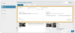
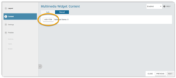
Manual mode: Add content
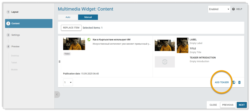
Hit the Add item button to manually add an item to the widget.
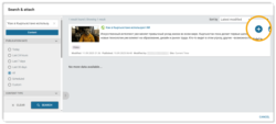
On the Search & attach dialog, search for and select the item you want to display. To run a content search:
- Hit Clear if needed to clear any existing search filters.
- Enter keywords and adjust the filters according to your needs.
- Hit Search.
The results refresh to match your search filters.

To select an item, click the + Attach button in the item box. This action adds the item to the widget edit page.
For detailed information on how to run a content search in Pangea CMS, see the following article:
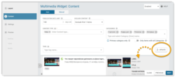
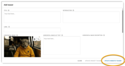
In manual mode, you can customize the teaser elements for the promoted item (such as the title and thumbnail image) directly from the widget edit page.
To customize the teaser, select Edit teaser or Add teaser in the item box.
On the dialog, you can update any teaser element. However, which elements will actually appear on the current widget depends on the type of content (horizontal video, vertical video, or audio), and the layout settings.
Find more details below:
NOTE: Multimedia widgets cannot display Loop videos.
To confirm any updates, select Update website teaser.
NOTE: The new elements will be displayed the current widget and also replace the default Any content page in Pangea CMS can have Website teaser settings. The Website teaser settings do not appear on the actual content page. Instead, Pangea uses these settings to generate the teaser for the story that is displayed across your website. For example, elements from the Website teaser settings may appear on widgets and Category pages. Learn more. settings for the item. This means your changes may also be visible on other pages where the item is shared.
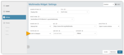
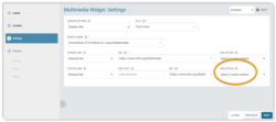
Manage settings
The following main actions are available on the Settings subpage:
Display a header
You can display a text header above the widget. The header can be either plain text or a clickable link to another page.
A clickable header link allows visitors to find more content on the same topic. For example, if a widget promotes content from a particular Categories help to organize content both in Pangea CMS and on Pangea websites. A Category is normally a topic, such as "Politics" or "Sport". Every content page must have at least one Category. Categories act like folders on a computer, where items are stored and organized. Learn more., the header link might point to the A Category page is a page on the public website where visitors can browse all the content from a particular Category. These pages are automatically generated and normally include a list of content, organized by date of publication. Learn more..
To display a text header:
- Select Display title under Header options.
- Under Title, enter the header text.
- If you want the header to be a link, configure the link under Header link.
Configure a standard or manual link.
Standard link
A standard link opens in the same tab and points to one of the following page types on your website:
- Category page
- Section page
- Infopage
- Special page (for example, your Subscribe, Podcast, or TV Schedule page)
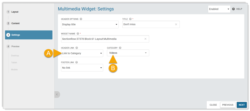
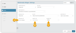
Complete the following settings:
- (A): Header link: Select the page type you want to link to (Category, Section, Infopage, or Special page).
- (B): Category / Section / Infopage / Special page: Select the specific page you want to link to. Click inside the box and start typing to quickly find a page.
Manual link
A manual link might point to any URL. You can choose how the link opens.
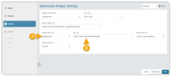
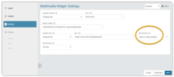
Complete the following settings:
- (A): Header link: Select "Manual link".
- (B): URL: Enter the URL for the link. For pages from your own site, you can enter a relative URL (such as /home). For pages from external sites, you need to enter the full URL (such as https://rferl.org).
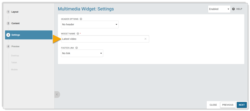
Under Link option, set how the link will open:
- Open in new tab: The link will open in a new tab. You might use this option for links to external sites.
- Open in same window: The link will open in the same tab. Always use this option for links to your own site.
Update the widget name
Under Widget name, optionally update the internal widget name. This name will only be visible in Pangea CMS. Adding a descriptive name will help editors to identify the widget, which is especially important if the widget is a A library widget is a widget stored in the Widget library. The Widget library is a collection of ready-to-use widgets. One library widget might be used in multiple places across your website. Learn more..
You can display a footer link below the widget. A clickable footer link allows visitors to find more content on the same topic.
TIP: If a widget has both a header link and a footer link, these links should normally open the same page.
Optionally configure a link under Footer link.
Configure a standard or manual link.
Standard link
A standard link opens in the same tab and points to one of the following page types on your website:
- Category page
- Section page
- Infopage
- Special page (for example, your Subscribe, Podcast, or TV Schedule page)
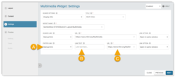
Complete the following settings:
- (A): Footer link: Select the page type you want to link to (Category, Section, Infopage, or Special page).
- (B): Link text: Optionally enter custom link text. Leave this box empty to display the default link text for your website.
- (C): Category / Section / Infopage / Special page: Select the specific page you want to link to. Click inside the box and start typing to quickly find a page.
Manual link
A manual link might point to any URL. You can choose how the link opens.
Complete the following settings:
- (A): Footer link: Select "Manual link".
- (B): Link text: Optionally enter custom link text. Leave this box empty to display the default link text for your website.
- (C): URL: Enter the URL for the link. For pages from your own site, you can enter a relative URL (such as /home). For pages from external sites, you need to enter the full URL (such as https://rferl.org).
Under Link option, set how the link will open:
- Open in new tab: The link will open in a new tab. You might use this option for links to external sites.
- Open in same window: The link will open in the same tab. Always use this option for links to your own site.
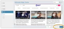
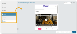
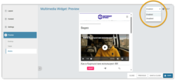
Check the preview
On the Preview subpage, you can check how the widget will look for website visitors when it is published. The preview shows the whole page / component, so you can see how all the widgets will look together. Choose your preferred option:
- Desktop: Check how the widget will look when viewed on a desktop computer.
- Tablet: Check how the widget will look when viewed on a tablet.
- Mobile: Check how the widget will look when viewed on a mobile device.
The preview includes unsaved changes. You do not need to save changes before checking them in the preview.
Save the widget
To save the widget, hit Save or Save & close on the widget edit page.
Saving the widget may trigger the following actions:
- If the page or component that contains the widget is published, the widget is immediately published.
- If the page or component that contains the widget is in draft, the widget is saved in Pangea but not published.
Save without publishing
The widget statuses give you added flexibility when the page or component that contains the widget is published. The following statuses are available:
- Enabled: The widget is visible on the public site.
- Disabled: The widget is hidden (not visible on the public site).
IMPORTANT: If you are editing a widget that is already published, changing the status to Disabled will make the widget disappear from the public site.
To save a new widget without publishing it:
- Select the Disabled status.
- Hit Save / Save & close.
The widget is now saved with the Disabled status. It is not visible on the public site.