What's inside this article:
- Basic information
- Create a FactCheck page
- Create a new widget
- Add content
- Add a header / footer
- Add a custom widget name
- Preview the widget
- Set the status and save the widget
Basic information
The FactCheck widget lets you share and promote FactCheck pages. A single FactCheck widget might promote one or multiple FactCheck pages. This widget includes an at-a-glance summary for each promoted FactCheck page.
This article explains how to build a new FactCheck widget from Pangea CMS.
Create a FactCheck page
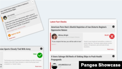
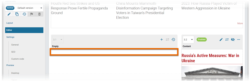
Every FactCheck widget uses the same layout. The summary for each promoted FactCheck page includes the following elements:
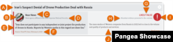
- (A): Title
- (B): Statement author image
- (C): Statement author
- (D): Statement author description
- (E): Statement content
- (F): Statement source
- (G): Verdict title
- (H): Short verdict description (if provided)
- (I): Verdict icon
- (J): Verdict introduction
All these fields need to be filled on the edit screen for the FactCheck page before you build the FactCheck widget. For detailed information, see the following article:
Create a new widget
The following segments might include a FactCheck widget:
- Sections (including your homepage)
- Infopages
- Landings
- You Might Also Like (YMAL)
To create a new FactCheck widget:
- Go to Build in the primary navigation. Select a segment type, depending where you want to display the widget (Sections, Infopages, Landings, or YMAL).

- Select the name of the specific segment where you want to display the widget.

- Ensure Editor is selected.
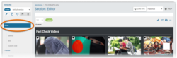
- Select the empty area where you want to add the widget.
- Select New widget > FactCheck to start creating a new FactCheck widget.

The widget edit page opens in the same tab.
NOTE: You can also create a new FactCheck widget from the Widget library.
The chapters below describe each stage of the creation process:
- Add content
- Add a header / footer
- Add a custom widget name
- Preview the widget
- Set the status and save the widget
Add content
On the Content subpage, choose which content is promoted on the widget.
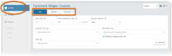
First, select your preferred mode. The mode controls how the widget content is added and updated. The following options are available for a FactCheck widget:
- Auto: The widget will always promote the latest FactChecks that meet the widget rules (defined in Pangea CMS). As new content is published, the older items on the widget are automatically replaced. For example, you might create a widget that always promotes the 5 latest FactChecks from a particular Category.
- Manual: Every FactCheck on the widget is selected manually. You can set the position for each item.
- Semi-auto: The widget includes a combination of manual items (set according to the rules for "Manual" mode) and auto items (set according to the rules for "Auto" mode).
For more information about your preferred mode, see the relevant article below:
- Use Auto mode to create a widget
- Use Manual mode to create a widget
- Use Semi-auto mode to create a widget
Add a header / footer
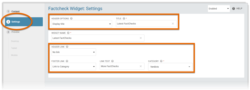
A FactCheck widget might include one or both of the following elements:

- (A): Header: Displayed above the widget. The header might be text-only, or it might function as a link to another page. If preferred, you can use an image as the header.
- (B): Footer: Displayed below the widget. The footer always functions as a link to another page.
On the Settings subpage, optionally add a header and / or a footer.
The steps for adding the header / footer are the same for every widget. For detailed information, see the following article:
Add a custom widget name
Via Settings > Widget name, optionally customize the default widget name.

The Widget name is visible only in Pangea CMS (not on the public site). We suggest providing a descriptive name if your site uses the Widget list tool in CMS to manage widgets.
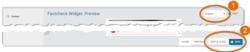
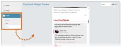
Preview the widget
On the Preview subpage, check how the FactCheck widget will look when it is published on the public site. Select Desktop, Tablet, or Mobile to preview the widget on devices with different screen sizes.
Set the status and save the widget
Before saving the FactCheck widget, select your preferred status using the drop-down menu in the top-right corner:
- Enabled: After you save the widget, it will be immediately visible on the public site (if it is included on a published page).
- Disabled: After you save the widget, it will not be visible on the public site. However, it will be available for further editing in CMS.
Select Save or Save & close to save the widget.