What's inside this article:
- Basic information
- What is aspect ratio?
- Match the required aspect ratio
- Crop an image
- Embedded images
- Images on gallery pages
- Main visuals on Feature story pages
Basic information
Pangea CMS might automatically crop your images. This is necessary, because most images need to fit within a specific "window" or "frame" when they are displayed on the public site. There is no specific size requirement. However, images are cropped automatically to fit the required aspect ratio.
This article explains how you can avoid unwanted cropping when you work with images in CMS.
What is aspect ratio?
Aspect ratio describes the proportional relationship between the width and the height of an image. Aspect ratio is expressed as two numbers separated by a colon (such as 1:1 or 4:3). The first number represents the width, while the second number represents the height.
The aspect ratio determines the shape of an image, but not its size. For example, if the aspect ratio of an image is 1:1, the width is the same as the height (the image is a square). However, the image size might be 50 x 50, 500 x 500, or any other size with matching width and height.
Match the required aspect ratio
If an image matches the required aspect ratio, Pangea CMS does not crop it. The required aspect ratio varies, according to the image orientation (horizontal or vertical). If your site creates custom images, use the guidelines below to match the required aspect ratio:
Horizontal images
Horizontal images are framed using the 16:9 aspect ratio.

The following common image resolutions exactly fit the 16:9 frame:
- 1024 × 576 pixels
- 1280 × 720 pixels
- 1366 × 768 pixels
- 1600 × 900 pixels
- 1920 × 1080 pixels
To avoid unwanted cropping, create horizontal images using these resolutions (or any other resolutions that fit the 16:9 frame).
Vertical images
Vertical images are framed using a non-standard aspect ratio that is very close to 3:4.

Use of a non-standard aspect ratio is necessary to ensure that vertical and horizontal widget layouts fit neatly together in the grid system (for example, on Section pages).
The following image resolutions fit the 3:4 frame:
- 1080 x 1440 pixels
- 1200 x 1600 pixels
- 1392 x 1856 pixels
- 1440 x 1920 pixels
You can use these resolutions for custom vertical images. However, be aware that a very small section will be cut at the bottom of the image when it is displayed on the public site.
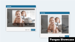
Crop an image
If an image does not match the required aspect ratio, Pangea CMS automatically crops it. If you are not satisfied with the automatic cropping, you can manually crop the image. To crop an image, select the Crop the image button.

The required aspect ratio is automatically maintained during cropping. You can change which portion of the image is visible, but you cannot change the aspect ratio.
Embedded images
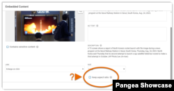
For embedded images on content pages, you can choose your preferred option:
- Keep the original aspect ratio (display the full image with no cropping).
- Apply the 16:9 aspect ratio.
In the embed settings, tick Keep aspect ratio to keep the original aspect ratio. If you do not tick this option, the 16:9 aspect ratio will be applied.
Images on gallery pages
The original aspect ratio is automatically maintained for images on the following gallery pages:
This means the full image is displayed by default with no cropping.
Main visuals on Feature story pages
The Main visual on a Feature story page is displayed within an adaptive frame. This means that the framing varies slightly, depending on the size of the screen / window where the page is viewed.
On mobile, the Main visual is framed using the 16:9 aspect ratio, and the visible section of the image exactly matches the cropping in Pangea CMS. On larger screens, the lower section of the image might not be visible.